BlindNavi
A navigation app specially made for the visually impaired. Design for the experience of going out.
Designer Hsuan-Eng Chen, Chien-Hsing Chen
Professor Hsien-Hui Tang, Neng-Hao Yu
Software Engineer Yi-Ying Lin, I-Fang Wang
Intro
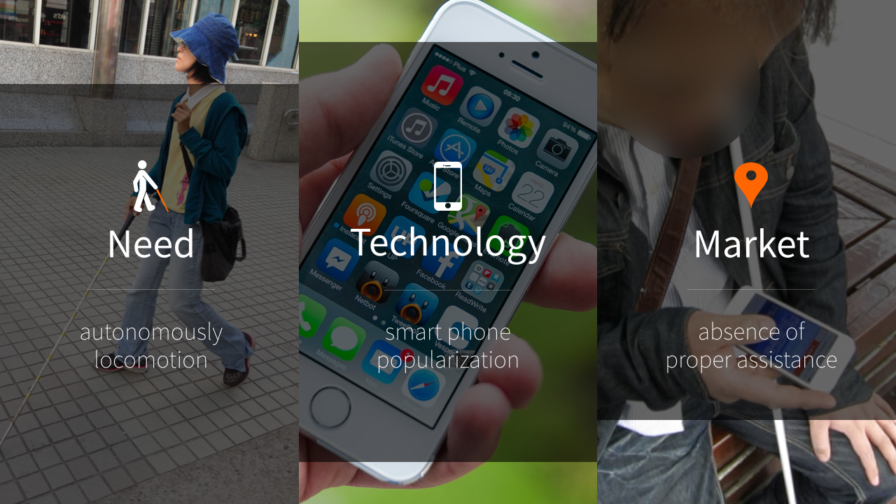
Using mobile apps to help route finding is very common for most of us. However, these apps with touch screen are not friendly for visually impaired people who eager for going out independently. Moreover, apps widely used now are not specially made for the visually impaired, therefore create much confuse and problematic user experience. The main purpose of this project is to provide a new mobility-aid solution of navigation app, which helps remember meaningful information over the journey, and make the trip safer and smoother.
Unlike those applications provide visual guides, we want to refer to the way blind people recognize and remember the road, and provide the multi-sensory messages combining familiar reference points that they’ve learned from O&M training. “BlindNavi” is an app prototype with 3-step simple search, flat flow design, voice feedback consisting of multi-sensory clues, combined with micro-location technology, to assist visually impaired people going out easily and explore the outside world on their own.
Project Overview
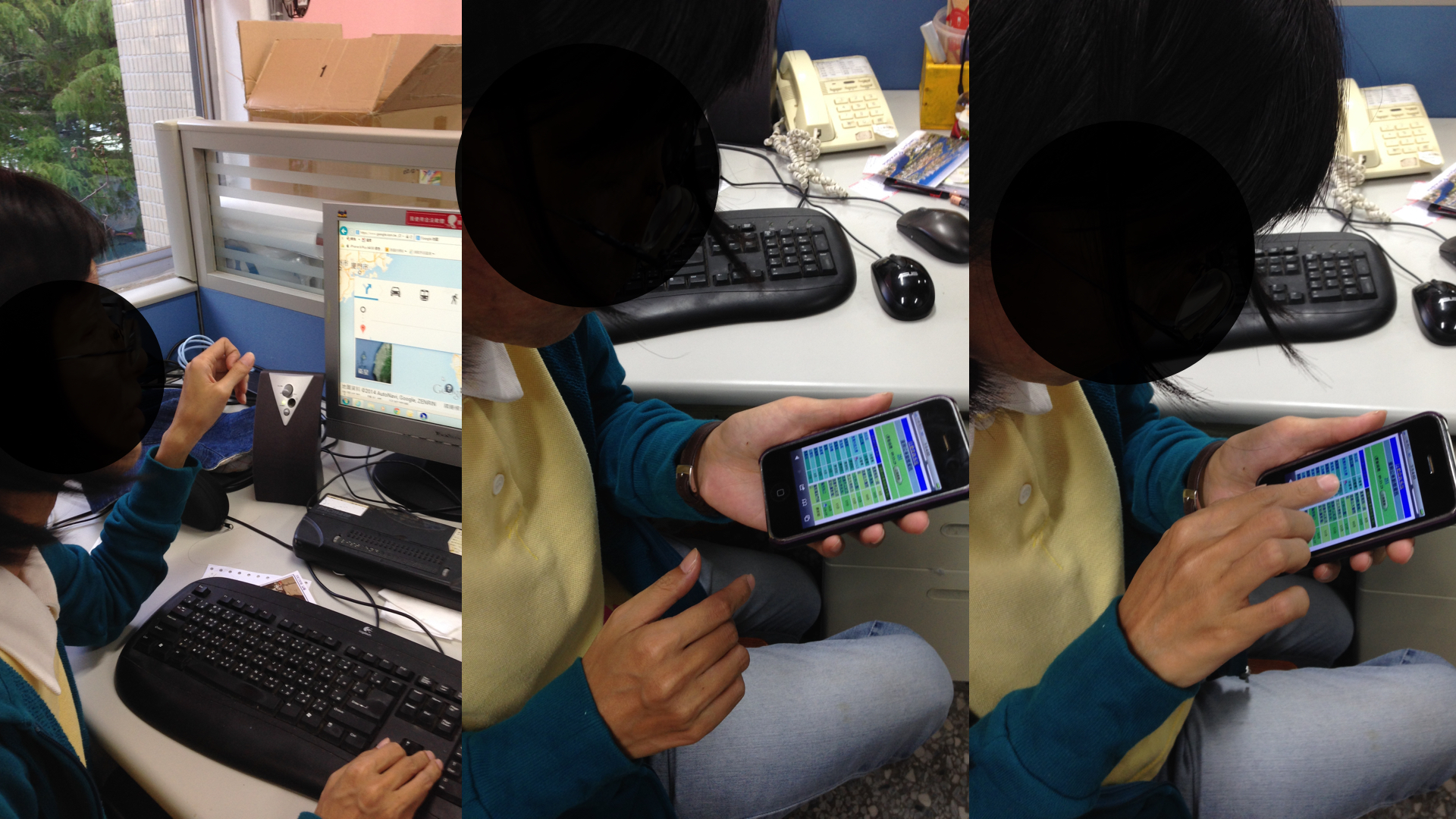
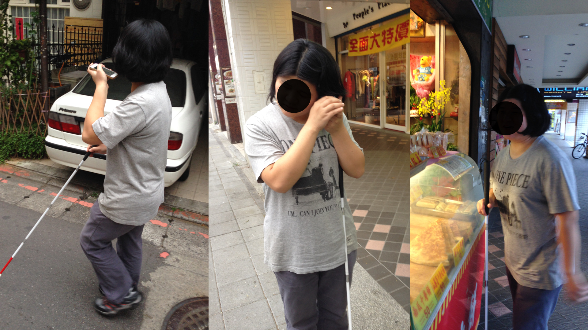
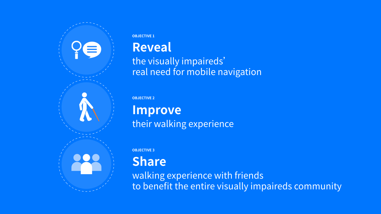
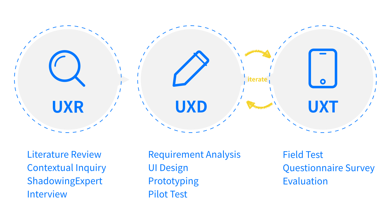
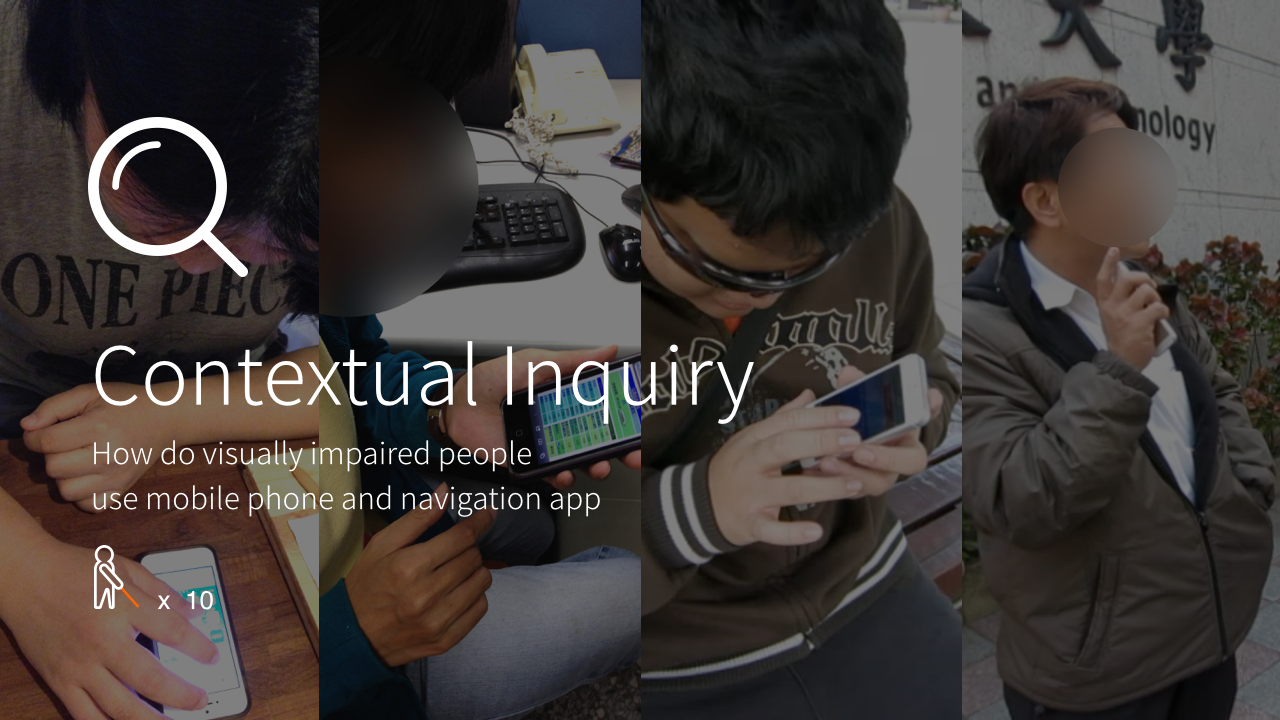
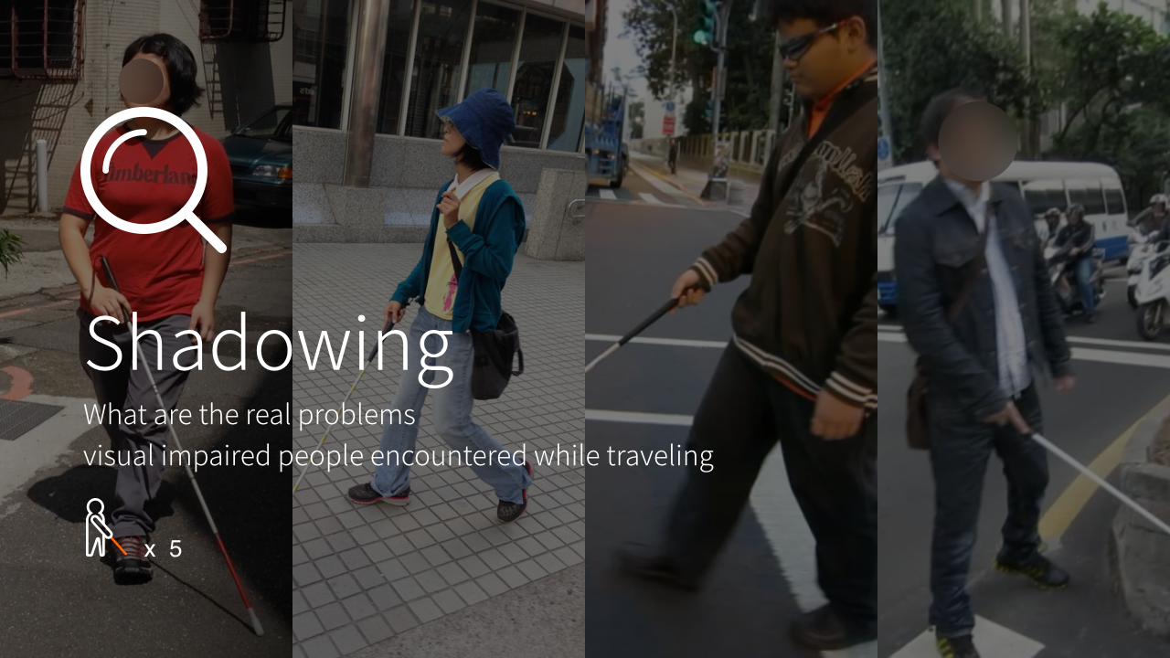
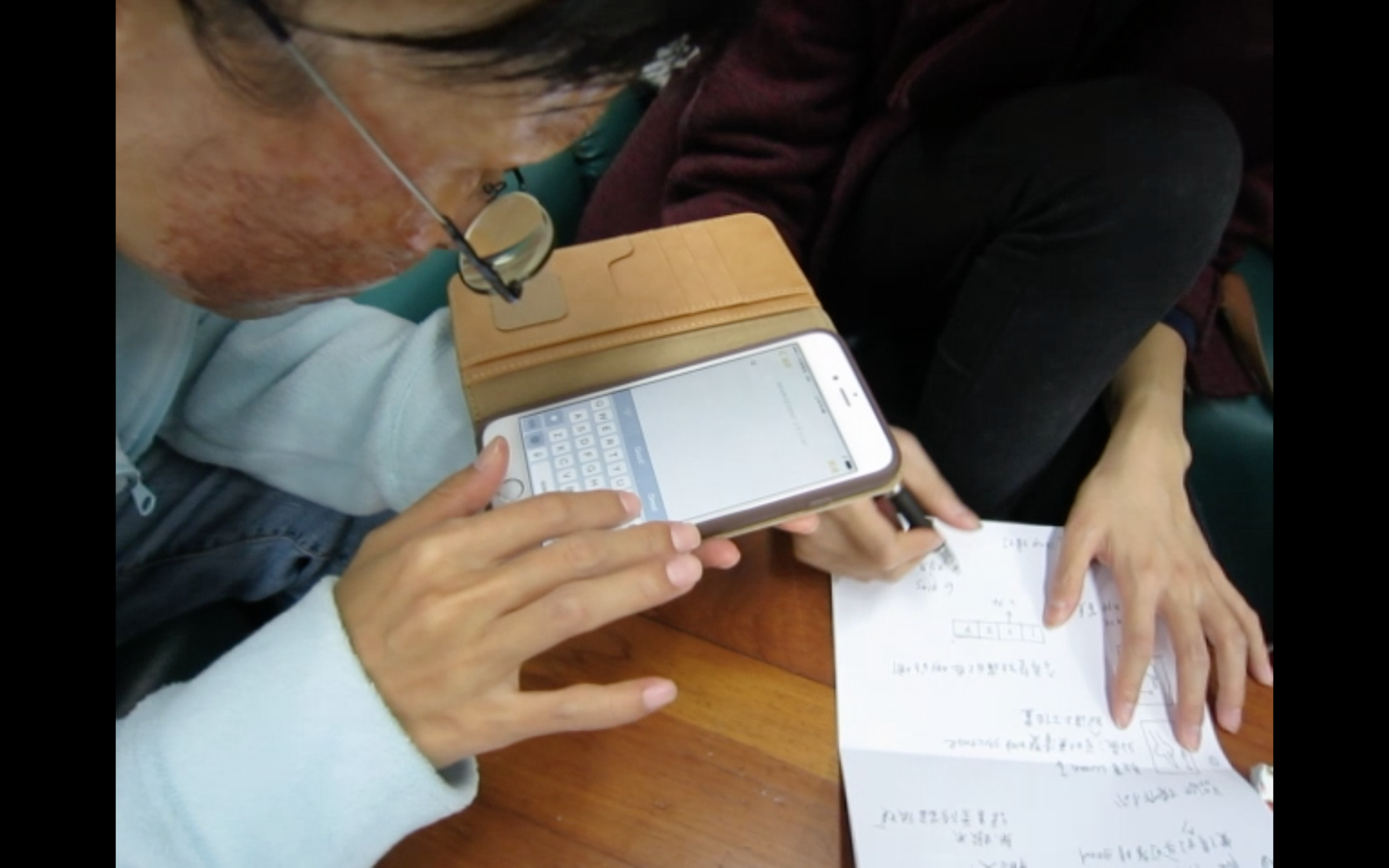
This is the structure of the entire project. We did a deep research to understand the visually impaired smartphone user's real need for mobile navigation. Afterwards, we conclude several needs from the research to develop our design strategies and make prototype. Then we invite some of our target users to test the prototype and give us feedback for the next design iteration.
Research
Design
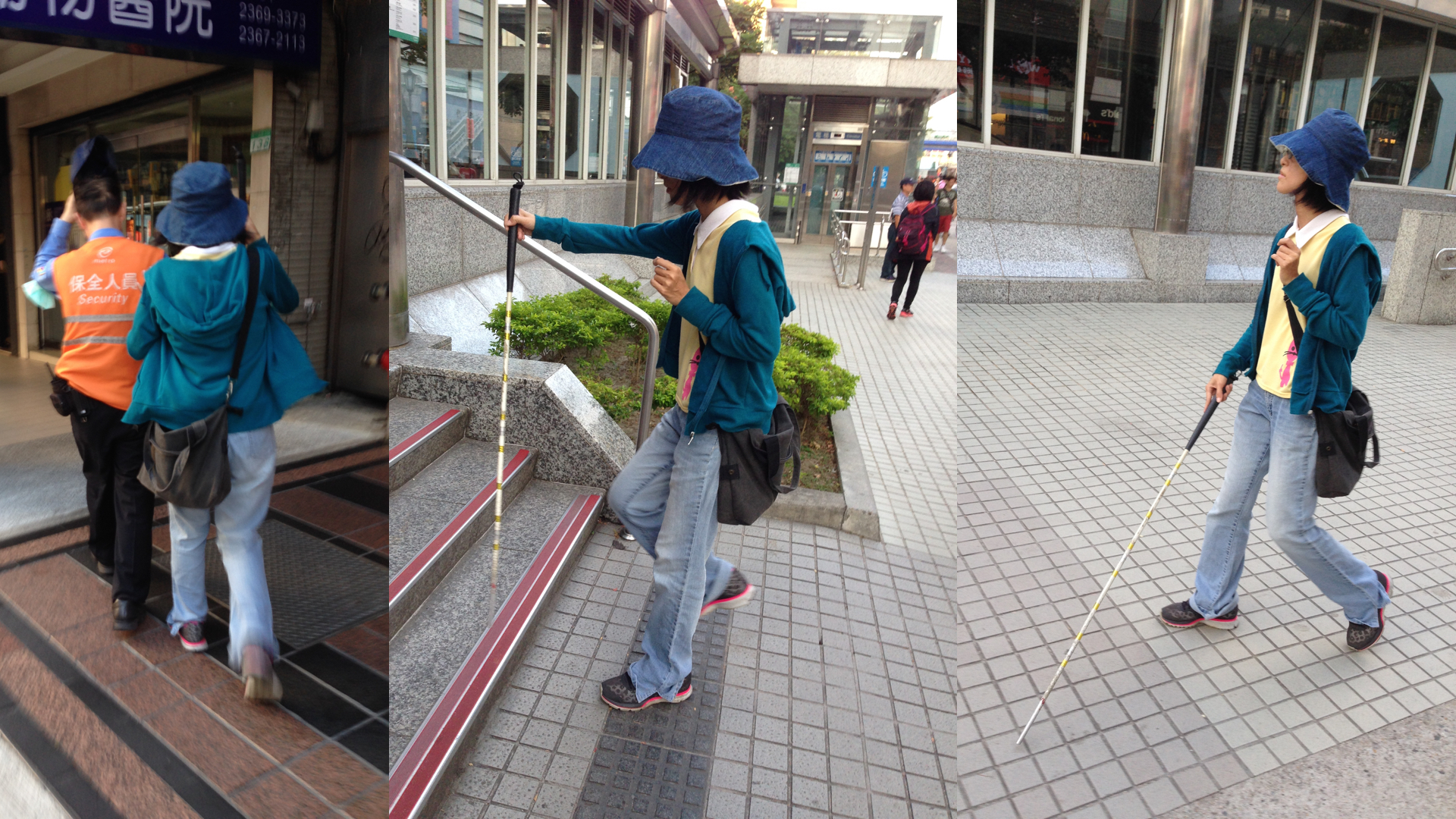
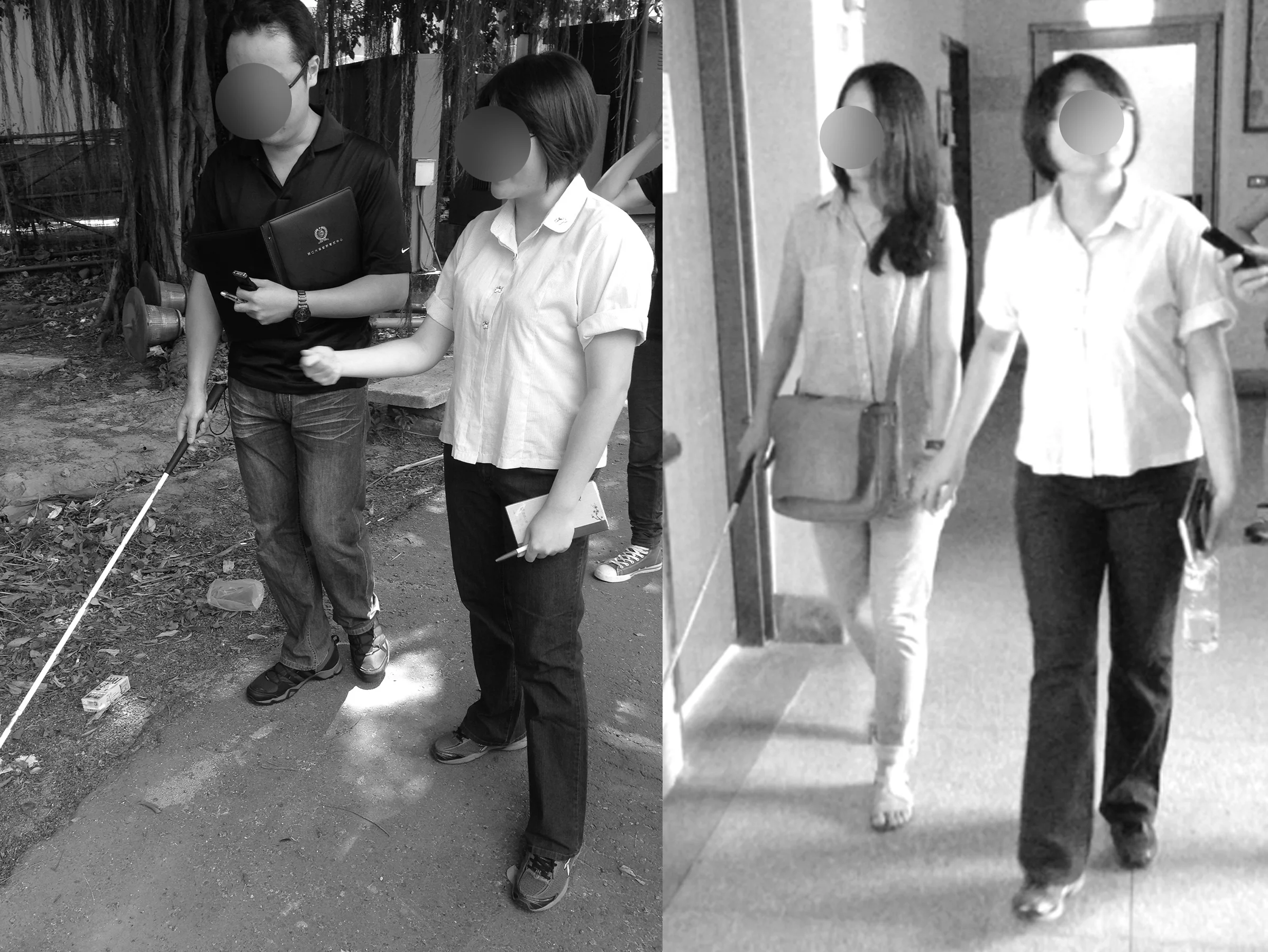
The target user of BlindNavi is a visually impaired smartphone user with large demand for autonomously mobility. He/she must have the experience of orientation and mobility (O&M) training. Abilities like recognizing clock position, finding zebra crossing by hearing car sounds, avoiding obstacles on the road are required.
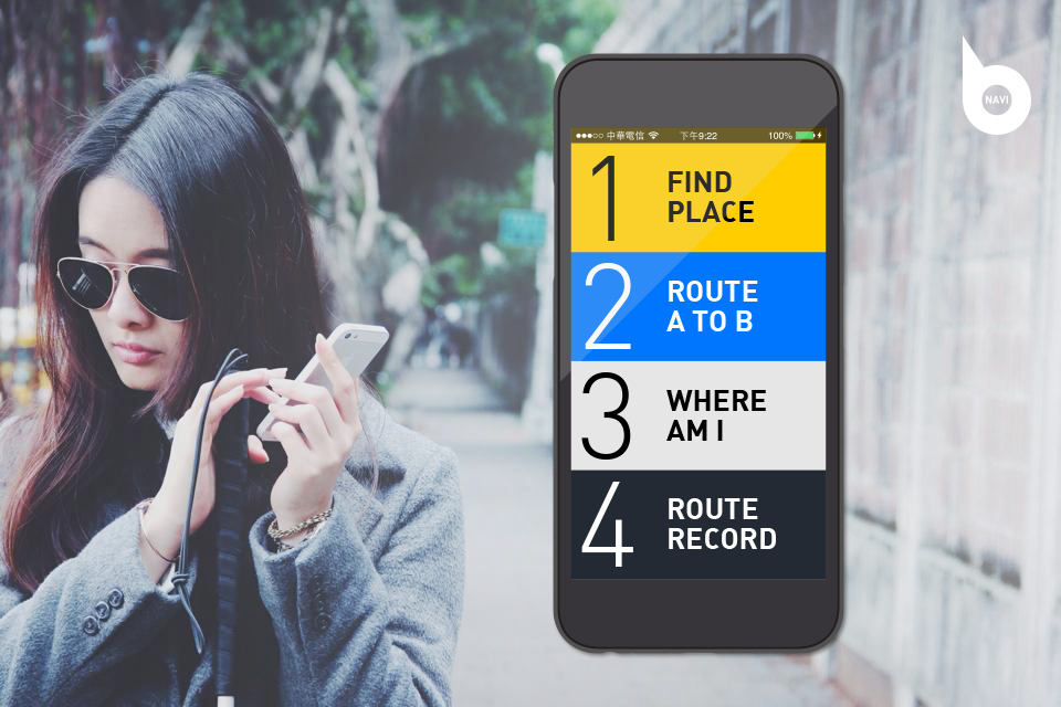
According to our pilot study, we conclude our design direction as following: 1) Find Address & Phone Number; 2) Route A to B; 3) Where Am I; 4) Route Record. 6 features in BlindNavi are designed to solve the problems we discovered from our interviews and observation.


1.Tedious Search Process vs. Easy 3-step Search
Normally, users have to switch between many so apps to get different kinds of information e.g. address, phone no., complex route / transfer plan, bus information, or more location details. All these are crucial to the preparation of going to somewhere they’ve never been before. In order to get what is needed, they have to go through the whole cumbersome process.
In BlindNavi, search is quick and easy! 1)Just tell the app where to go; 2)Select the correct address; 3)You''ll get the phone number of your destination. And you can easily share all those information with friends!
2.Typing Problem VS. Less typing in the whole process
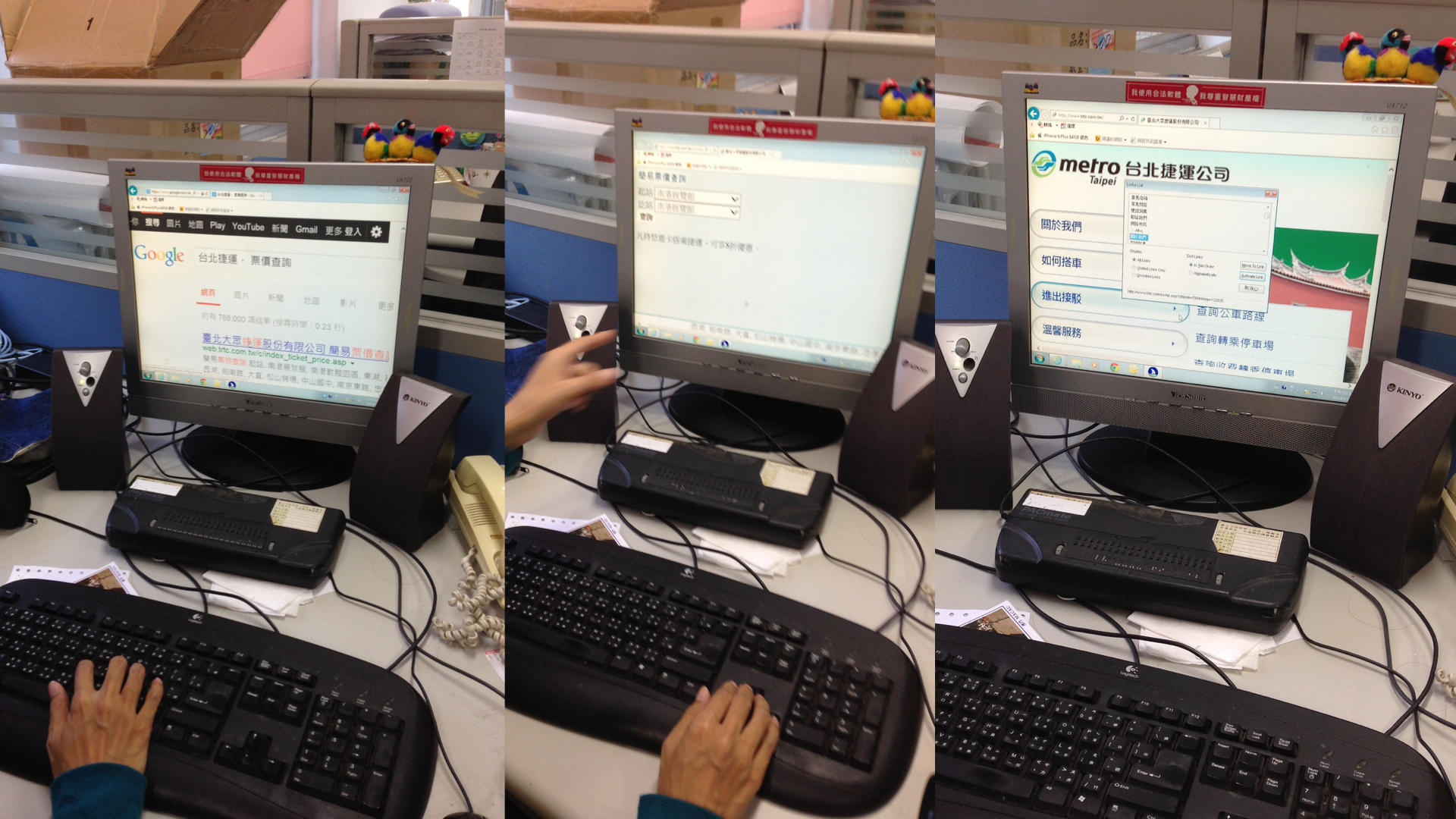
Switch between apps and key-in the text to the right spot is time-consuming. It has become the main reason why the visually impaired prefers to search information on PC rather than their cell phone. Problems include: 1)Select each alphabet on keyboard is slow; 2)Speech input may occur erros that requires modification; 3) The VoiceOver gesture of copy paste is not always functional.
BlindNavi pre-fills text to the right spot. It saves the time spent on typing and get users to what they need in a few seconds.
3.COMPLEX UI LAYERS VS. FLATTEN INFORMATION STRUCTURE
It’s easy to get lost for the visually impaired to switch between complex UI layers. Most of the apps requires user to “go back” to previous layer to start another task. However, too many layers would only make users feel lost.
Users are able to exam all search results on the same screen without switching between different app layers in BlindNavi. And start another search whenever needed.
4.Abstract & Imprecise Navigating Description VS. Multi-Sensory Clue as Navigation Content
Current navigation messages are hard to imagine for the visually impaired, for exam- ple, numbers of meters & the term of east, west, north, or south. These descriptions are too abstract for people without sight. Extra tools are needed to help identifying those concept sometimes.
Each navigating description includes 3 parts. First, the location name, it’s displayed as road intersections, lanes, bus/MRT stations or stops. Second, the environmental description, it’s delivered by the unique feature of BlindNavi with providing detailed clues around the user including felt by touch, hear, smell, or step. It can be auditory, olfactory, and tactile clues like car noise, 7-11 doorbell, or even the food smell. Sighted people often ignore these clues but it is the key point of “multi-sensory” clue navigation content. Last, corresponding action for the users such as making turns or going straight.
5.GPS Deviation + Lack of Immediacy VS. Micro-location info from iBeacon + Gesture Shortcut
“Current Position” is the most most frequent used function while navigating. But touch the screen to activate it seems not instant enough. Plus, GPS deviation is troublesome when the precise address (numbers of each door) is needed.
With BlindNavi activated, you can shake phone to get “WHERE AM I” information, including precise address, around spot, nearest bus/MRT station.
6.Fragmented Route Detail Memory VS. Personalized Route Record to Share
Each individual has their own way to memorize the route information. However,it’s hard to remember all the details on the road. Only fragmented memories left after going home. Not to mention review the route again or share those experience to help others. We've discovered there’s huge need for information preserving and sharing.
BlindNavi saves the route you’ve walked automatically for you to review. 2 taps on the spot to add your own memo to the place. And of course, It can be shared to your friends!


